UI and Product Design
Hideout.tv
Dates:
2017-2019
Main Collaborators:
Fehzan Ali (CEO)
Mike Dunn (CTO)
Tony Cohn (Marketing)
Platforms
Web
Android / FireTv
iOS
My Role:
User Research
User Flows
Wireframes
Prototyping / Testing
Micro Animations
High Fidelity Design
Hand-Off to dev and final QA
Hideout.TV was both a video platform and first of it’s kind monetization
solution within
the rewarded ad space. Like many existing video platforms, the main revenue driver
was
video ads. The biggest differentiator however, was that viewers were a major part of
the
ecosystem as they would earn points for watching; which they could redeem with one
of
Hideout.TV’s reward partners.
The idea began as a way to introduce video ads to the Adscend Media ecosystem. We
first
built an MVP on the web, which was a simple video player with a limited amount of
licensed content. Because we already had a substantial motivated user base in our
Offer
Wall product, we leveraged the MVP into our offer wall in order to test it with
actual
users. The MVP was a massive success as it saw quick user adoption, while at the
same
time showing us the challenges of working with video ads. We then decided to take
the
project further into a full fledged platform with user generated content as apposed
to
simply licensing videos and a host of other features for users as well.
MVP Feature List
11 Channel Categories of Curated Videos
Account Not Needed
Auto-Cash Out To Reward Platform After 3rd Ad
Videos continually auto-play
Web Only
Final Version Feature List
15+ General Channels of Curated Videos
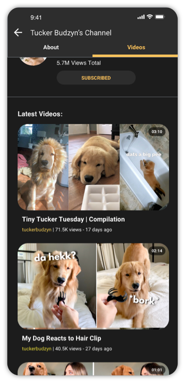
Video Creator Accounts: Create Channels, Upload Videos, Earn Ad
Revenue
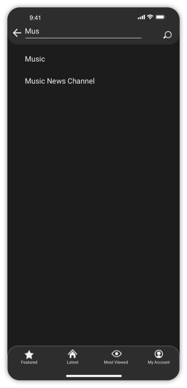
Search and filtering options for videos
Subscribe to channels
Video interaction: Like Videos, View Rewards As You Watch, Share, and
Reactions
Link reward account(s) to Hideout account
Store Earned Points into User Account, Redeem at any time
Notifications for Channel Subscriptions, Points Earned, Points
Redeemed
Videos continually auto-play
Web, Android App, and FireTV App launched. iOS App was built, but did
not
see the light of day.
Challenges
Fraud
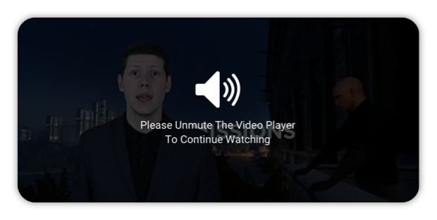
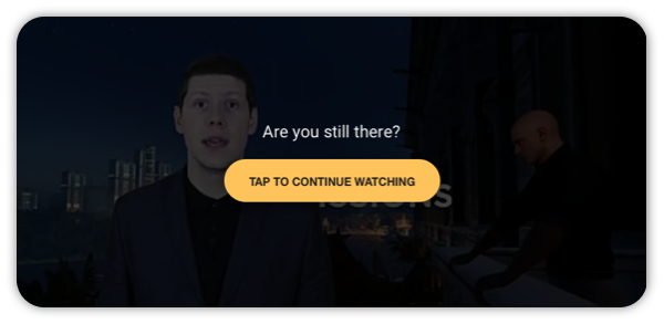
Fraud was always the first and foremost concern for us at Adscend Media. Online advertising campaigns can run very expesive budgets, so advertisers want to ensure their leads and impressions are genuine. On the end user side, we always needed to safeguard against those who would look to game the system. Measures such as limited sessions, user interaction / inactivity checker, mute checker, and a ton of other back end considerations had to be put in place. Legit users might still run into these implementations from time to time, so our goal was to always ensure the experience was not accusatory in any way. We created a whole support center with articles on how users could maximize their earnings legitimately, and also where they could contact us for help.
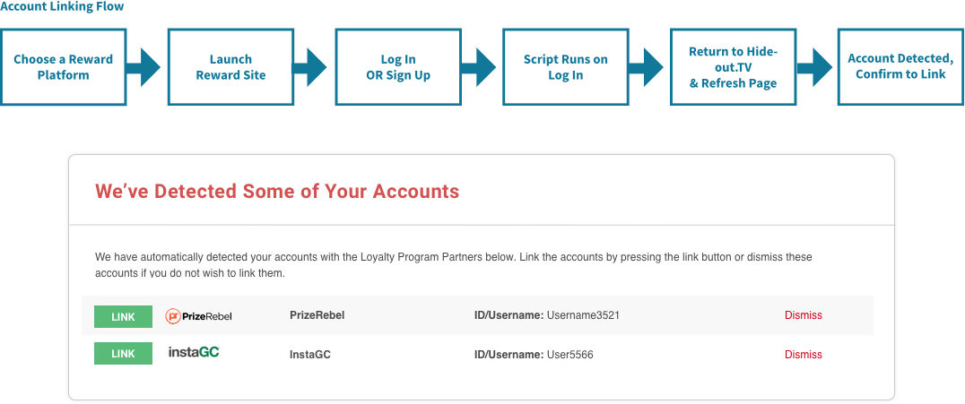
Linking Reward Accounts
Since we didn’t handle the rewards, we needed to find a seamless as possible way to link a user’s Hideout.TV account with their Rewards Account.Easy in theory, but our affiliates were not large companies and did not have an API we could integrate with. This meant that we had to take a slightly different approach where-in the UX may not have been optimal. Ultimately with the help of the engineering team, we were able to use a script that would detect users’ accounts automatically. The script was placed on the initial landing page after logging into the third party reward providers account, and all the user had to do was then return to their Hideout account and refresh the page.
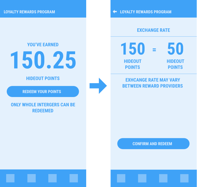
Redeeming Points
Because each reward provider could set their own payout terms for users, the points needed for rewards could vary wildly. Though the actual dollar amount was typically always the same, it meant that for one reward provider 100 Hideout points might equal $1.00, and for another 10,000 Hideout points could equal $1. This meant that upon redeeming your points on Hideout, a conversion needed to take place. Though this did require quite the explanation on the screen, we made sure the conversion amount was front and center and impossible to miss. Ultimately there is no way around these conversions, but we simply wanted to avoid user’s being unaware of what was happening with their points.
Team Size and Resources
Our team was small and resource limited. I was the only designer in the entire company and worked directly with the CTO. By this point, we did not have any in house engineers anymore, and that team was entirely out sourced. The ad industry being extremely volatile also meant we sometimes did not have the luxury of spending as much time as needed testing. As such, a lot of the UX work was done retro-actively after launching and getting live reactions. While this is not the ideal process, and I have always been a proponent of thorough testing before launching, it was one of the realities of what we had to work with. Luckily we already had a motivated user base.
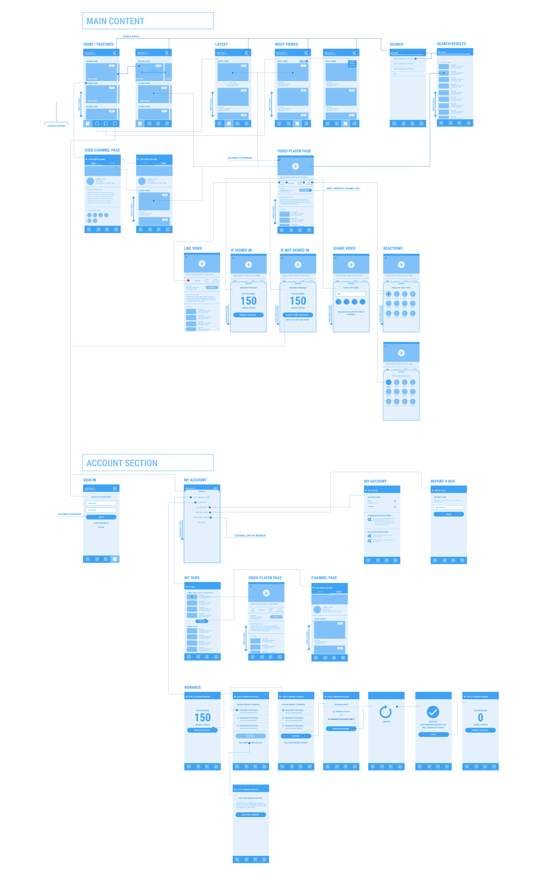
User Flows / Wireframes
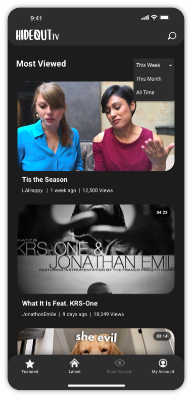
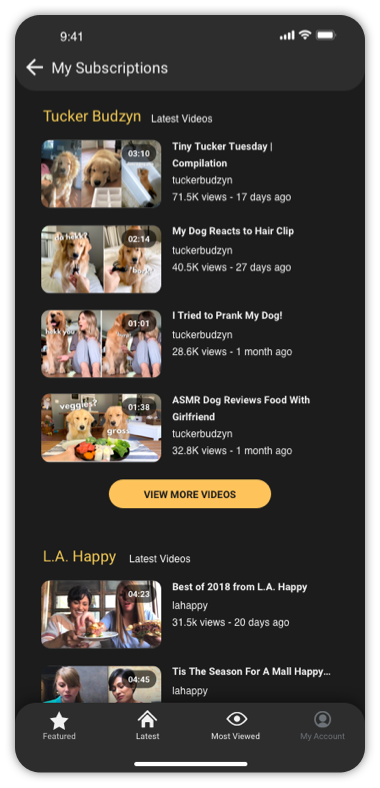
Since we were such a small team, creating the initial wireframes and user flows revolved around dissecting some of the biggest video platforms already established. Our goal was to make content easy to browse and find, and include all of our own features. Main navigation included featured user channels, latest uploads to the platform, and most viewed videos. Once on a video page, we included some social interaction features(like video, share video, and reactions) and also a dedicated area for users to view their accumulated earnings and redeem if desired.
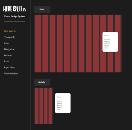
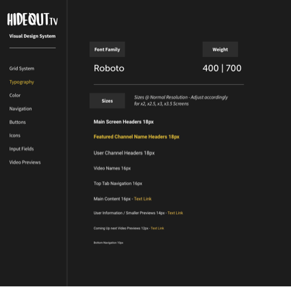
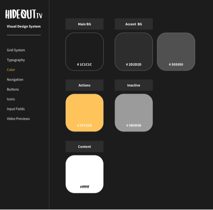
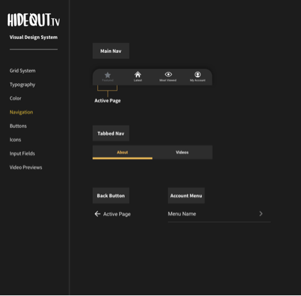
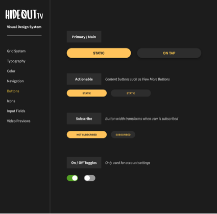
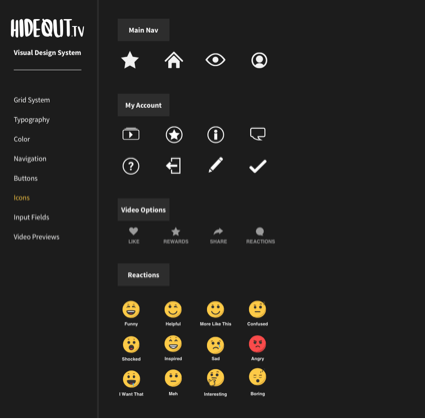
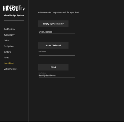
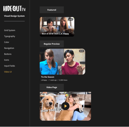
Visual Design Guidelines
A visual guide was created for the engineering team so they had easy access to specs including the grid system, headers, navigation, buttons, icons, input fields, and different video sizes. The visual design system was housed on our Zeplin project for easy access to actual specs.
Landing Screens
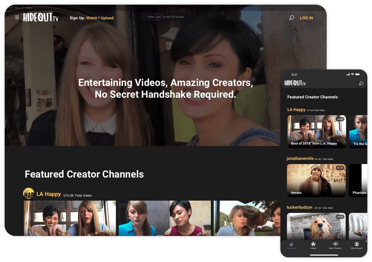
At initial launch, our team curated specific “channels” of various videos that users could watch. But as the platform grew, we began to onboard video creators to the platform and the focus became featuring the Creator channels front and center. The goal was to not lock videos behind an account; this way users could still view any video at any time. However, the biggest incentive for creating an account was to reap the rewards(literally) for watching.
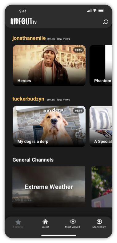
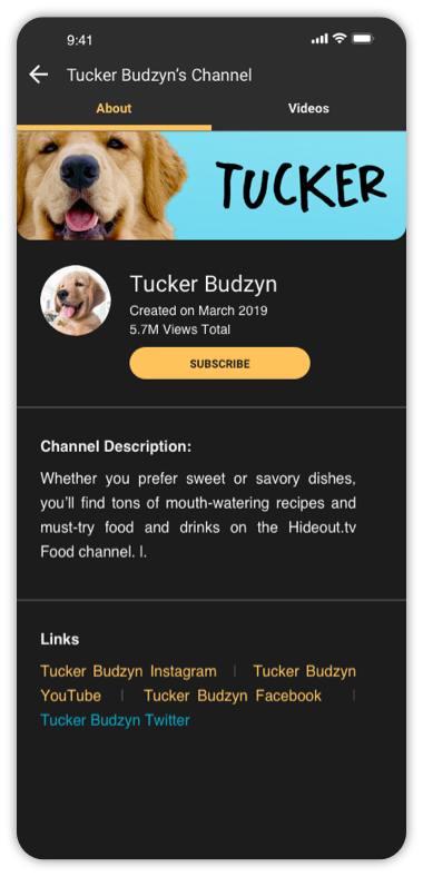
Creator Channels
Video Player Screen
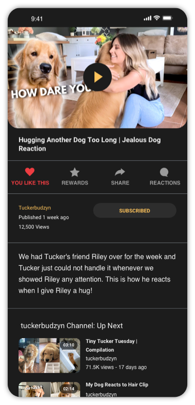
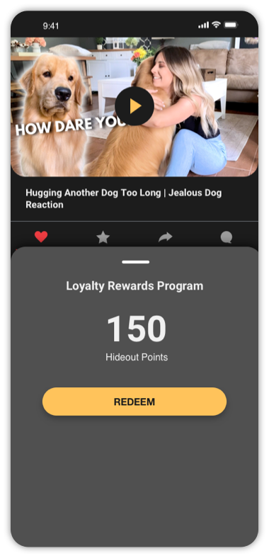
The video pages themselves boasted some similar features to other platforms. Including a
subscribe
button and a “Like” button. Because Hideout.TV was rewards focused though, another big
option
included an easy to access drawer that displayed the amount of currency the user had earned
up
to
that point. The redeem button was also highlighted so the user could go straight to cashing
out
at
any time.
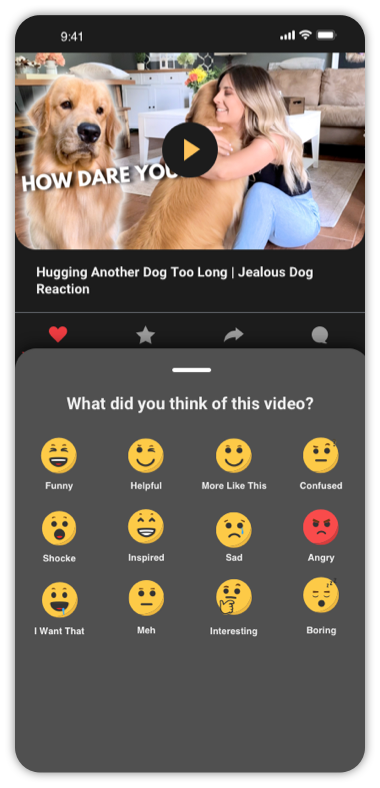
At the time, it was decided against including the ability to leave comments, but we also
integrated
a “Reactions” option as a way for users to leave video creators some form of feedback.
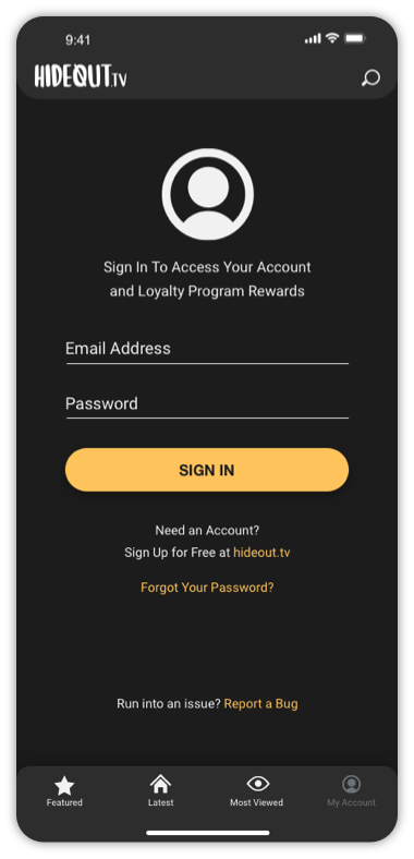
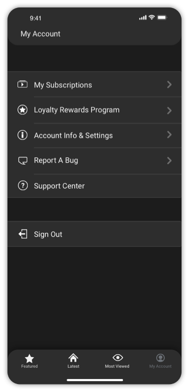
Account Screens
The My Account section of course boasted first and foremost a Sign In / Sign Up page. Once signed in, users could access their Subscriptions and account settings. Other options included a dedicated section to report any bugs, and an external link to our Support Center as well. Most importantly, this is where users could go to redeem their points.
In Closing
This was really just a piece of everything that went into this project. Mostly I just wanted to showcase the mobile app more than anything. Other pieces to this project included the entire web app / platform including a Creator Portal where approved users could create their channels, upload their videos, and view their stats. As well as few other user features. What this project looks like now, unfortunately I cannot say.